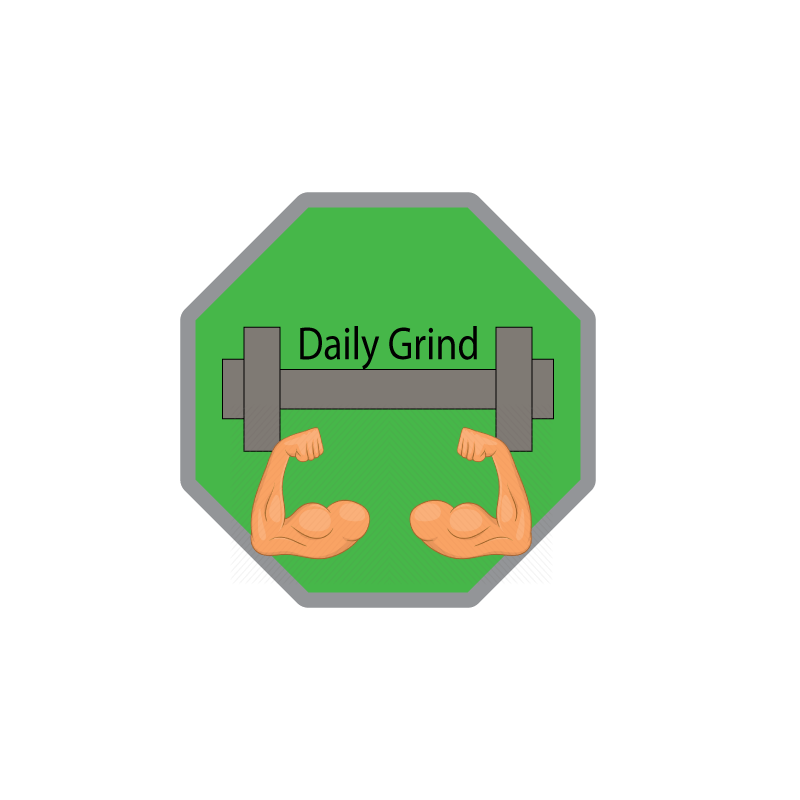
For my final Logo, I decided to add more to my draft and finalize the artwork by adding more detail that relates to my topic. When I first completed my draft, I felt that it was a little dry, and needed more changing, but I didn’t know exactly what to add. After I had time to think about it, I came to conclusion that my overall design was good, I just needed to change some placements of things, and add in some cartoon muscles. With this change, I was able to demonstrate my brand through my logo more clearly. During my design process, I noticed a lot of brands similar to my topic had some features that stood out to me, including the idea of adding weights and cartoons, so I decided to include both. I wanted my logo to be simple, yet effective, and I think the way I created my logo executed that perfectly, and even though I didn’t get feedback from classmates, the feedback given to me by my professor was to add more, but keep the same idea. Which lead to me including some cartoon muscles.
Technical Detail- While using Adobe Illustrator, I learned a lot of new things, and it helped a lot when it came to finalizing my logo. When originally putting it together I use all sorts of tools ranging from the line tool, rectangle tool, polygon tool, etc. While trying to change the colors on the shapes I ran into issues on how to make the logos colors most efficient so I added a green stop sign as an idea to not stop working out, and keep up the “daily grind.” after I figure that out, I used the stroke to make certain places on my logo stand out. Lastly, I rounded the edges on my main background to create a smooth touch and complete my logo.
Outside art work credit- ‘Healthy lifestyle – Cartoon’ by Ivan Ryabokon https://www.iconfinder.com/icons/1741167/arm_biceps_cartoon_fitness_hands_muscle_sign_icon

Leave a comment