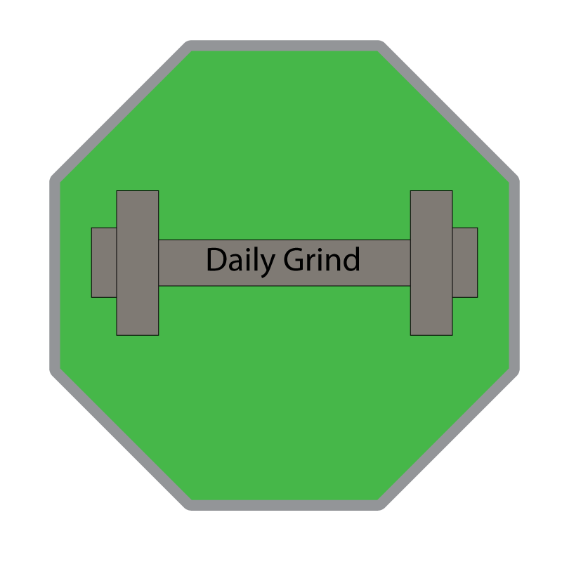
For my project logo I decided to go with the idea of making a sign that says “Daily Grind” since my topic is about working out. This sign includes a weight on a sign that’s like a stop sign, but I made it green, so the audience doesn’t mistake it for me trying to say stop working out. The idea of this logo came straight from my imagination, and at first, I was thinking of just having weights with the words “Daily Grind” above it, but I decided that adding the sign and making it green was a good touch. I think by adding this octagon shape behind the weights and name, it added the key element of motivation to those who view it. Although it’s a little corny to add a green sign that replicates a stop sign as an act to motivate those to keep going rather than stopping was a good idea. My design process from beginning to end followed a lot of the reading “5 Branding Basics Every Logo Designer Should Know.” When I first researched other gym brands, a lot of them had weights in the name, which makes sense since their brand is all about going to the gym. Another key part to the branding basics was having a short, simple, yet effective brand name, and I think the name “Daily Grind” delivered that perfectly. My logo however was different than any other similar logos since I had the idea of adding the sign in the background which I just thought of randomly while I looked at it and wondered what I could add to make it more interesting. Some of the tools and techniques I used in adobe illustrator involved a lot of the shaping tools, color tools, texting tools, and I added strokes and different effects to complete my shapes. Some problems I ran into were finding where some of the effects were located, but with enough clicking around I was able to figure everything out and complete my logo.

Leave a comment